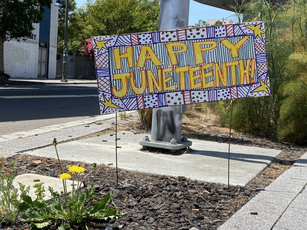
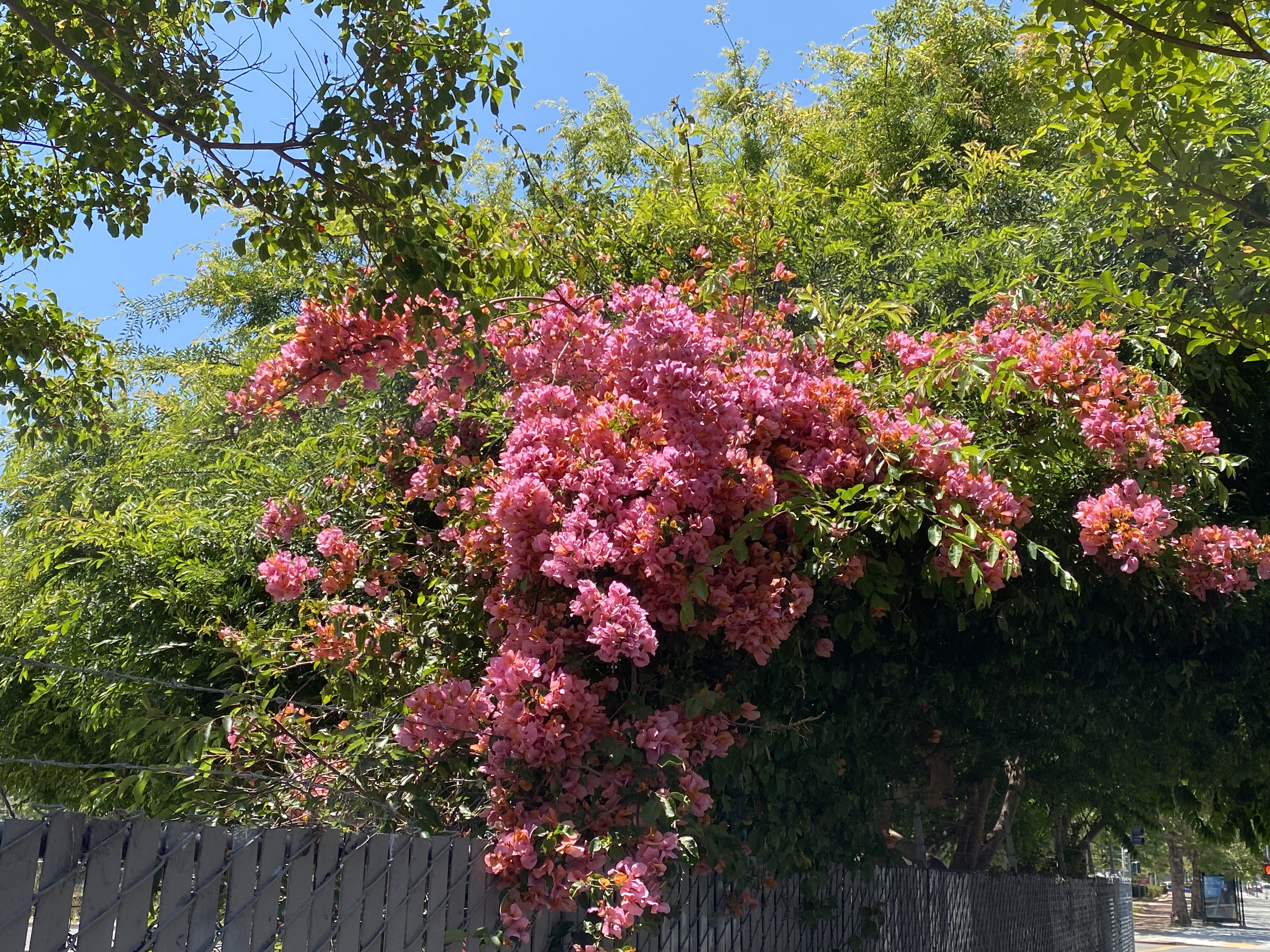
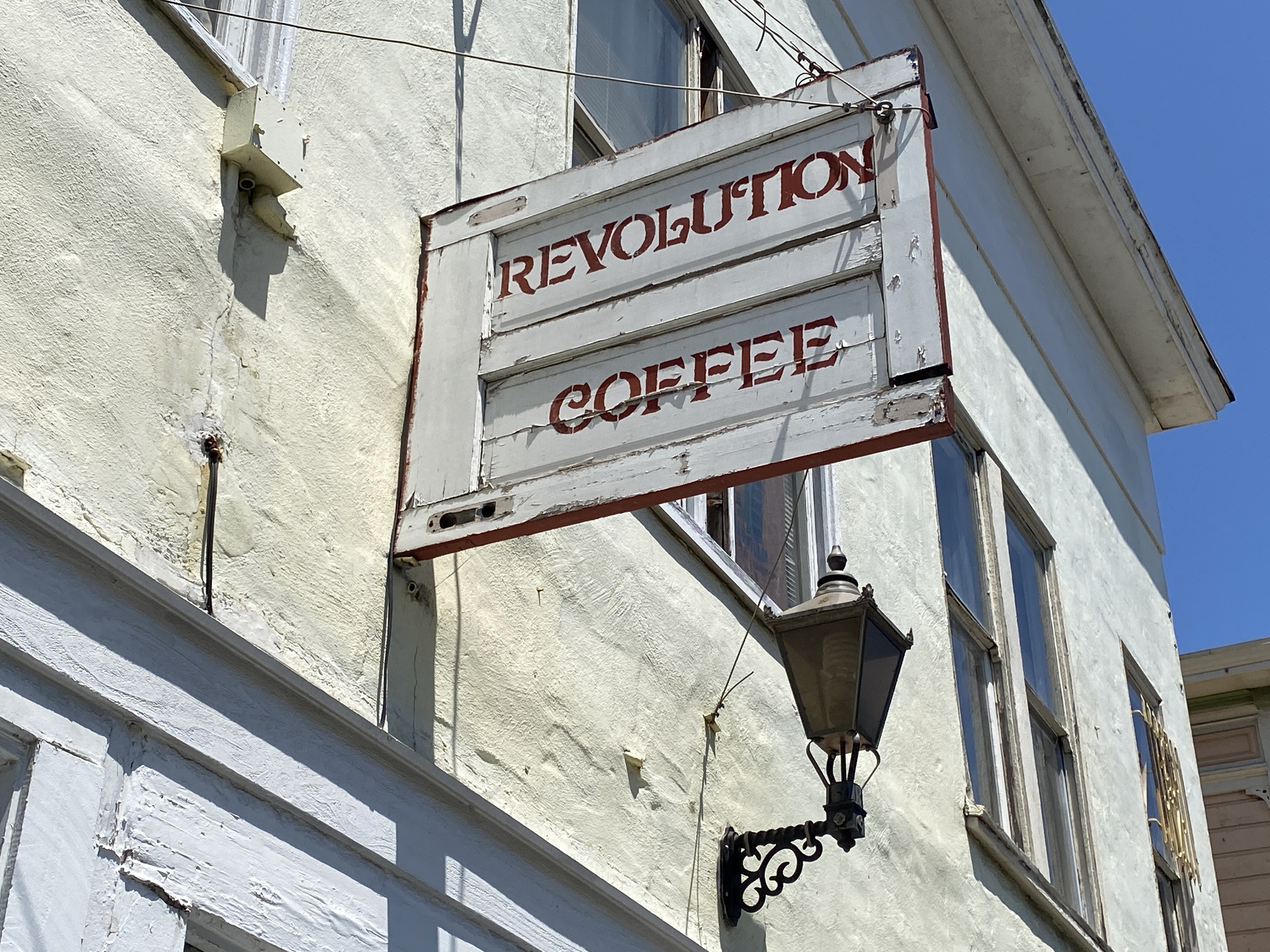
Like the sign says!!! Happy Juneteenth, everyone.
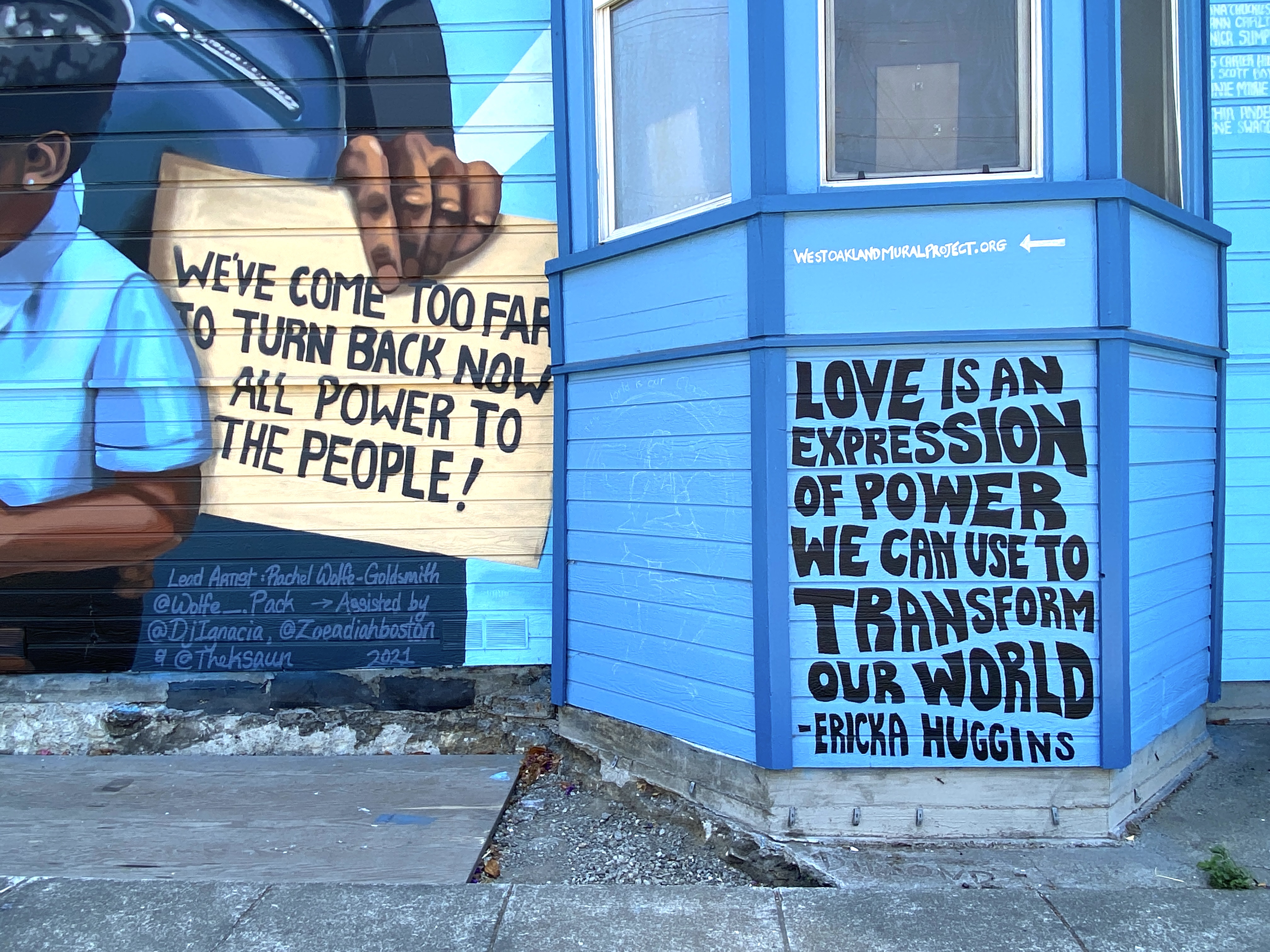
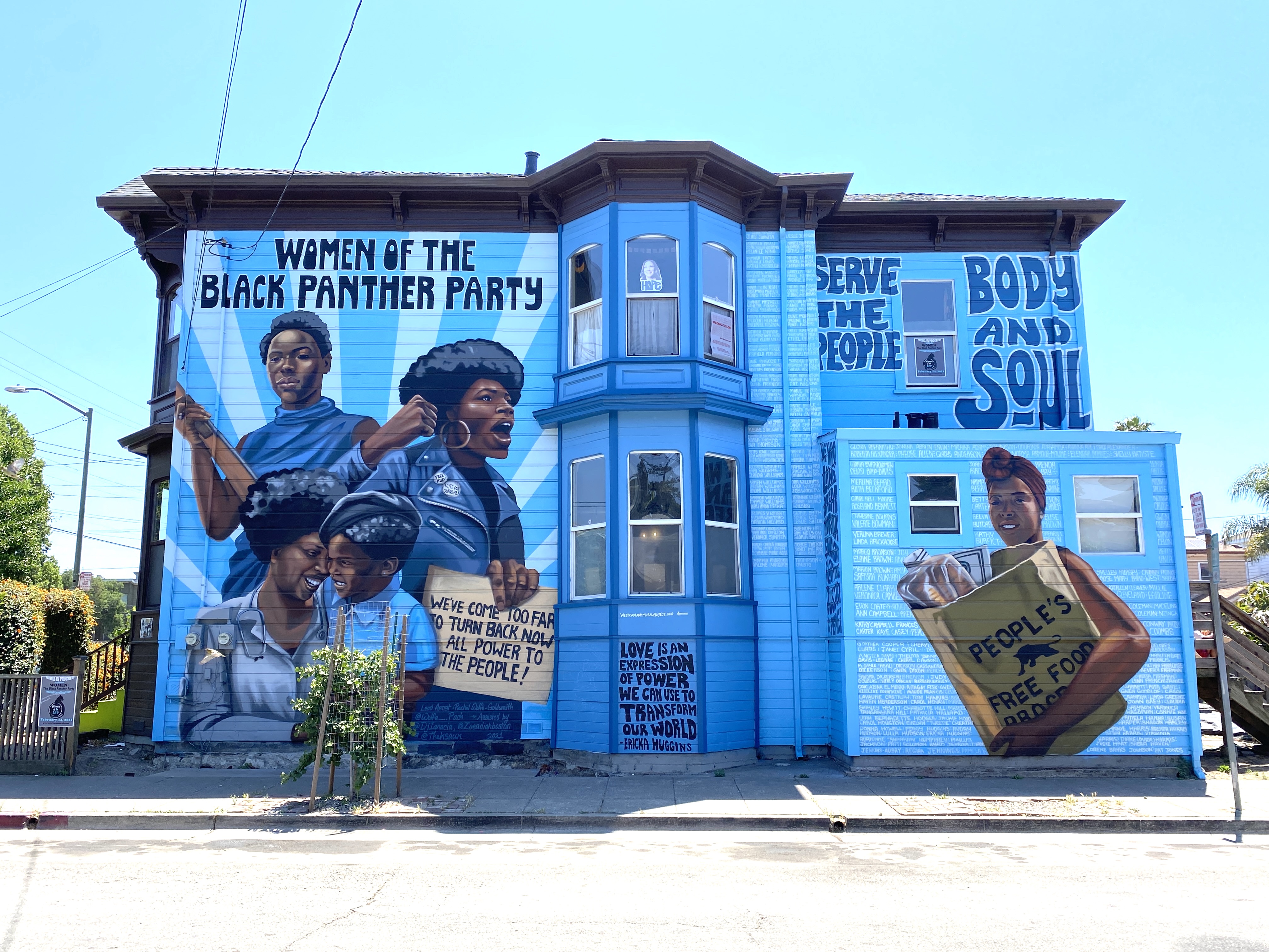
Women of the Black Panther Party mural courtesy of West Oakland Mural Project https://westoaklandmuralproject.org/.
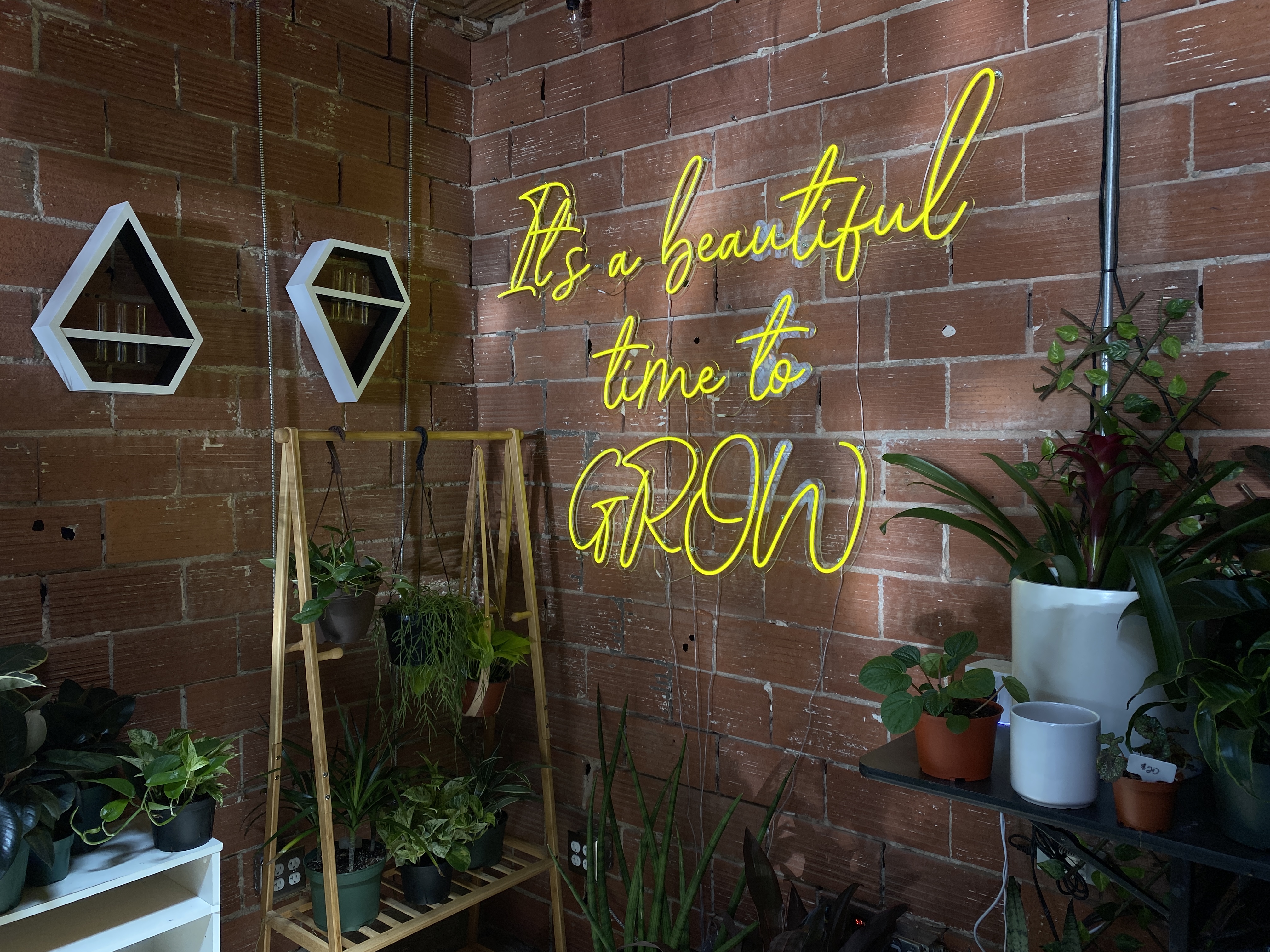
And fabulous neon inspiration courtesy of Black Grls Green House https://bggh.shop/
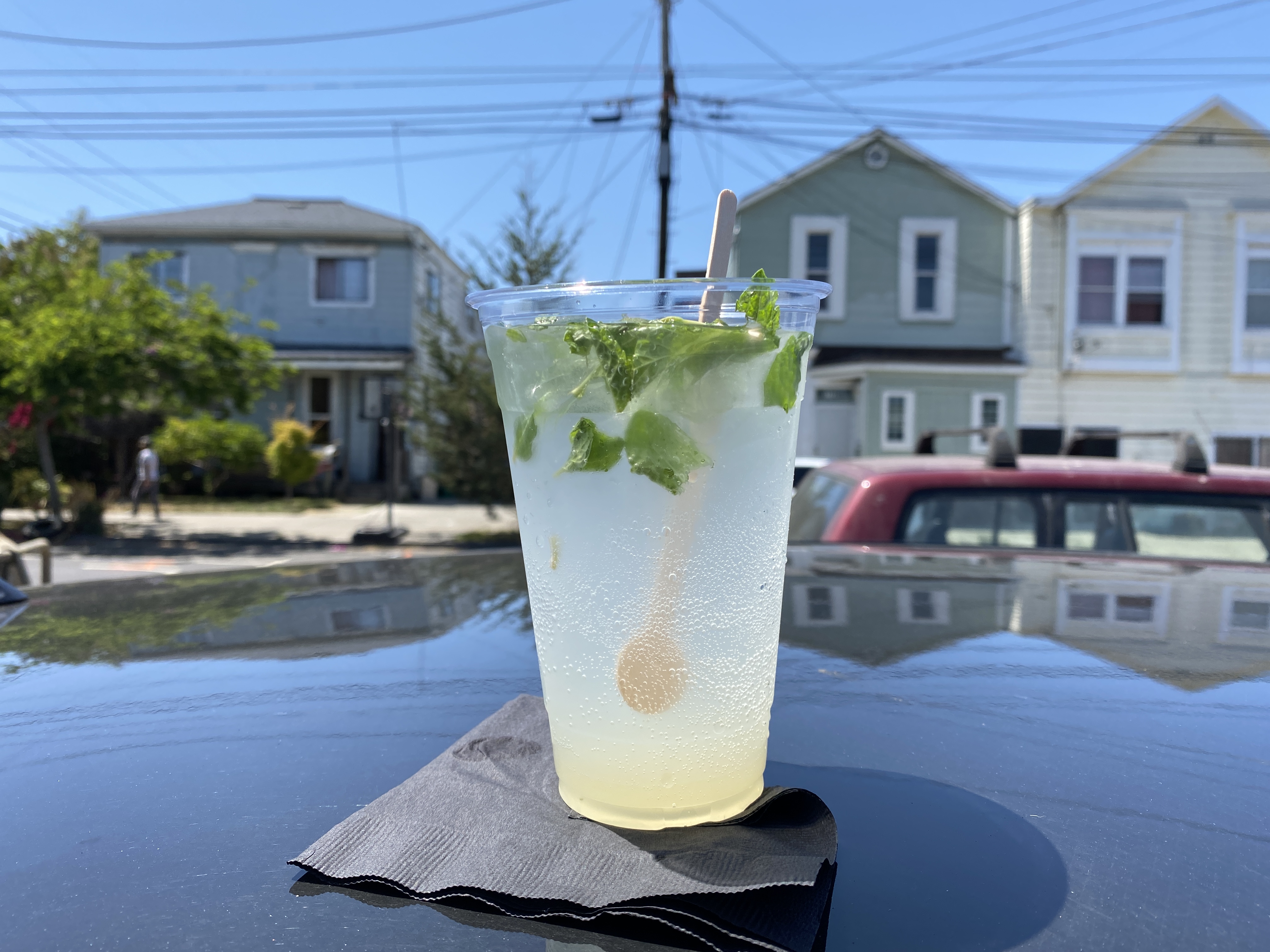
Refreshing Elderflower Spritzer courtesy of Blythe Coffee https://www.blythecoffee.com/
Here’s to ongoing liberation, reframing of narratives, and a joyous summer season!
A Query Regarding Attachments for Works of Art on Paper
Hi Chris,
We are working on a large project for your customer and as a nice consequence, we are able to fill out some documentation on the collection. As she works with you often for her framing needs, I was wondering if you could share with me what type of adhesive you use for her works? This would be valuable information to have in our files.
Many thanks, Your Inquirer
Hi Dear Inquirer,
I often state how frame design considerations are always a response to any given object/artwork. As a result there are a range of conservation adhesives and approaches which might be brought to bear depending on the media at hand, the condition of a given work, and other considerations.
Most commonly, though, for paper based works we are likely to use hand torn hinges made from various weights of Japanese papers, along with cooked starch paste. This is the most common museum/conservation standard for attaching works of art on paper into frames. But there are also other adhesives, including high quality, conservation grade PVA glues (white glues) that might also be used on their own, or cut into the starch paste (Jade-R being one of the most common we’d reach for but also another family of adhesives under the Lascaux brand). Additionally, acrylic or thermoplastic adhesives are used if the application involves dry mounting of photographs or other graphic works onto rigid substrates. And sometimes, we have call to use other techniques such as hand folded paper corners and other more creative attachments for unique works.
I am happy to go back and confirm what approaches we used for specific works, if you’d like to have that on file for those works. And I can share that we will be using paper/paste hinges to mount the current work in the shop (which is slated to be done at end of this week).
Let me know if you have additional questions! Yours–C.
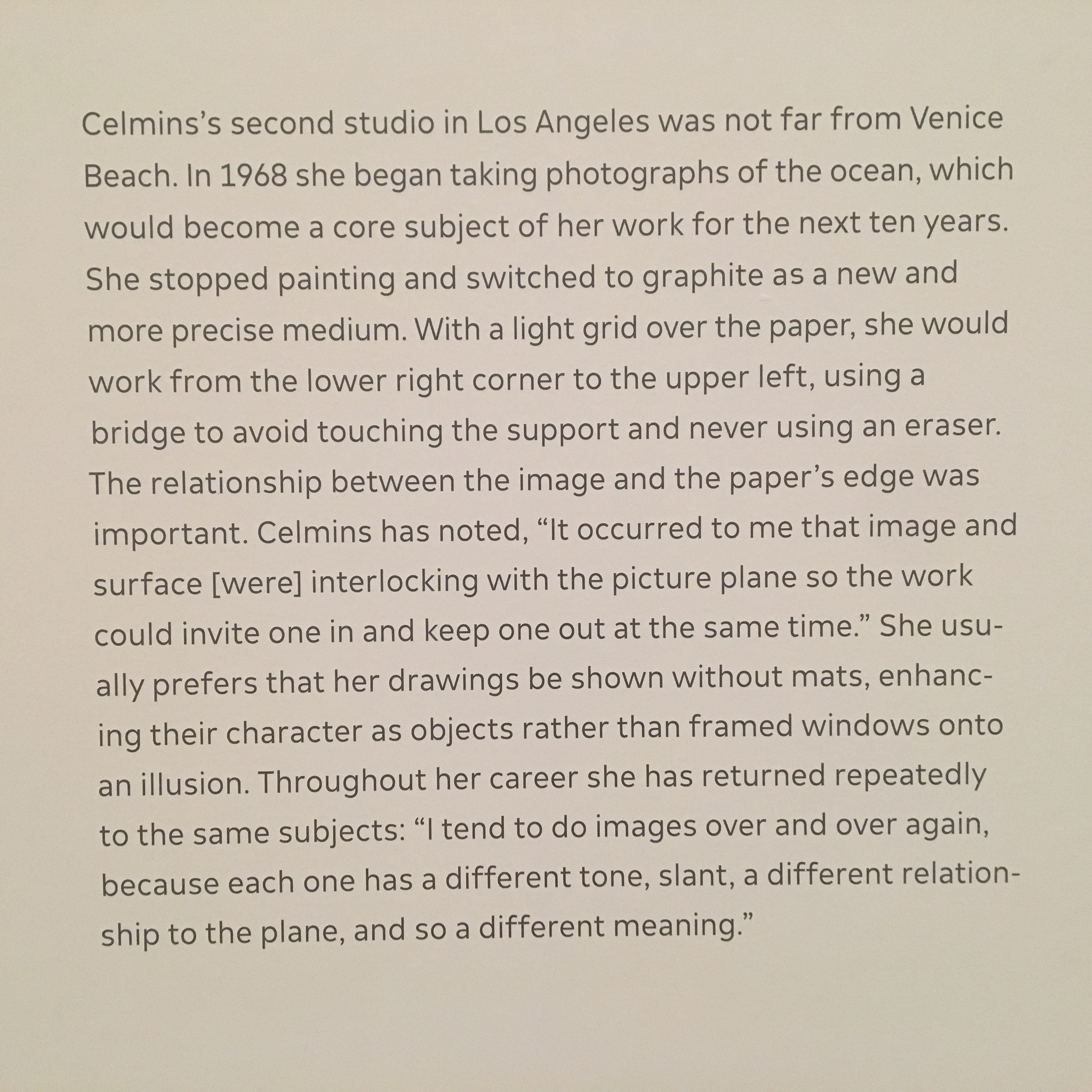
Some Framer Thoughts on Vija Celmins Exhibit “To Fix the Image In Memory”


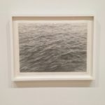
With the Vija Celmins exhibition at SFMOMA, I indulged my time-honored teadition of catching great exhibits right before they come down😉. Especially for people whose work and perspective involves materials and aesthetic choices, this one offers a very rich experience. If you didn’t see the exhibit, there is still a chance though you’d have to travel for it, as it goes on to, I believe, Toronto and then New York.
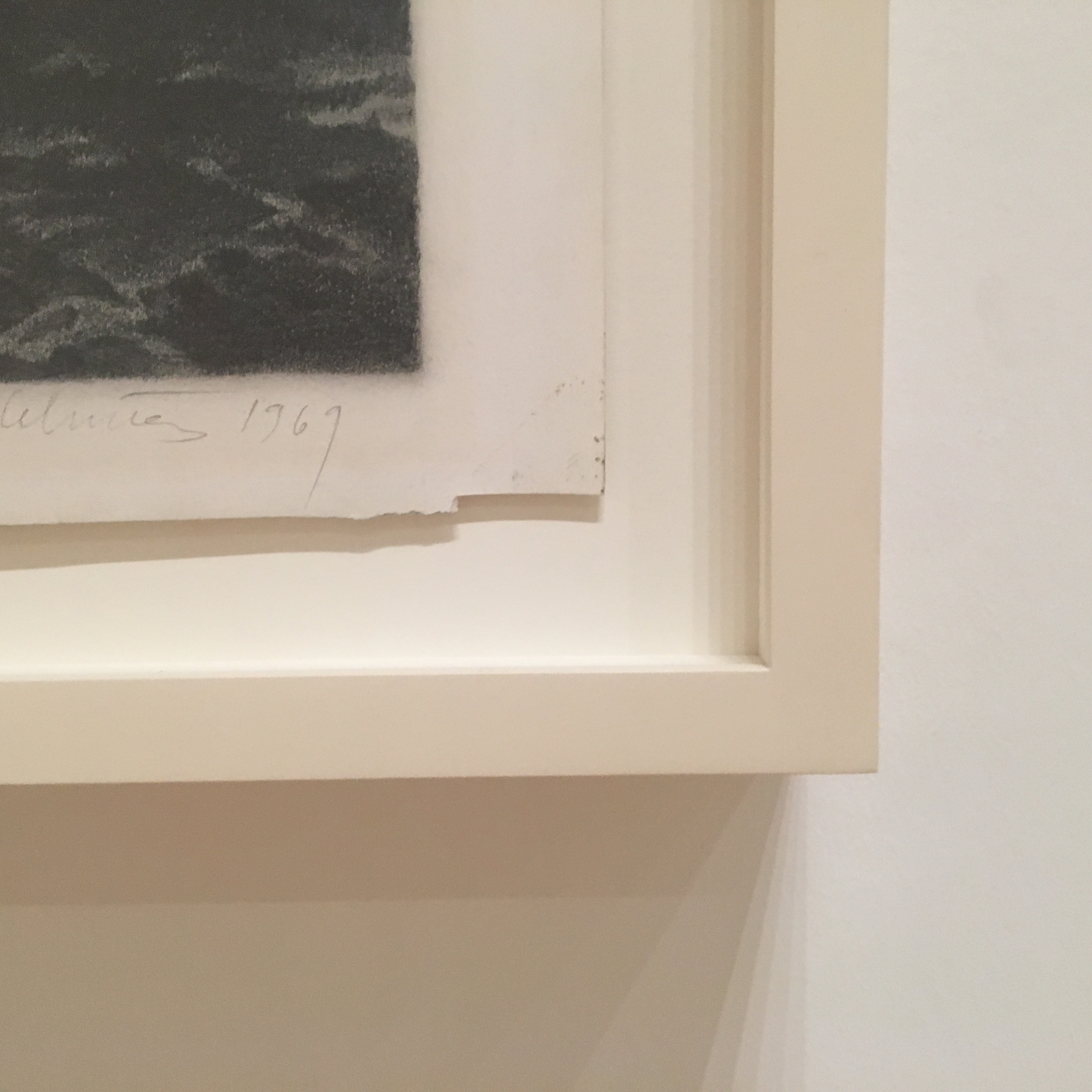
One of our central practices when working with our customers is to discern the object qualities of a given work—its medium and materials, how they were applied, what we might be able to glean about artistic intent and art historical precedents for presentation of like works. Even when something is perceived as a picture—say, a work on paper like a drawing or an etching—it’s helpful to note how the composition of a work relates to its page, or how the paper was treated by the artist, further imparting own object qualities in the process. Smudges in margins, pin holes at corners, torn edges, yes—this might tell part of a story. But papers are myriad in composition and texture, and respond differently after being heavily worked, erased, or amended with paints, inks, collaged elements. All of these challenge a planar, 2-d view of a work.
And there is the art-historical presence of the frame… The addition of functional and decorative borders is an old practice with roots in architecture and decorative arts. And we think at Sterling of frames as fine architectural expressions of articulated space incorporating decorative elements, preservation elements, and structural elements. By defining a work in terms of its art historical influences and precedents, we can look for “appropriate” architecture to frame a given work.
So I was very impressed by the degree to which Celmins’ practice holds the work-as-object so central to her processes. And when we frame contemporary works, though the architectural style tends to be simple in concept its success lies in the thoughtful consideration and execution of details; choice of materials; and sympathetic application of tone, texture, proportion.
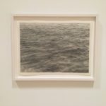
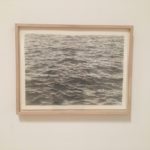
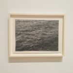
Celmins prefers much of her work to be presented, as objects. Numerous examples of this exist throughout the exhibit. Here are several of her untitled Ocean drawings from the late 60’s into the 70’s. All of these drawings were made with pencil on paper which was first coated with an acrylic ground. All are the same in size—but these examples show instances of how scale of mouldings and tone of finishes, as well as amount of visual float all work together to present the works in a fitting architecture which presents the works as both as drawings and as objects—but made by different framers for different collectors at different times. An illustration of nuance and its importance in the framing of contemporary art!
#SFMOMA#Celmins #framing #presentation#arteducation #arthistory
Sterling Art Services
1558 7th Street
Oakland, CA 94607
View on Google Maps
Contact
(415) 863-5800
info@sterlingartservices.com